Putting the logic into logistics
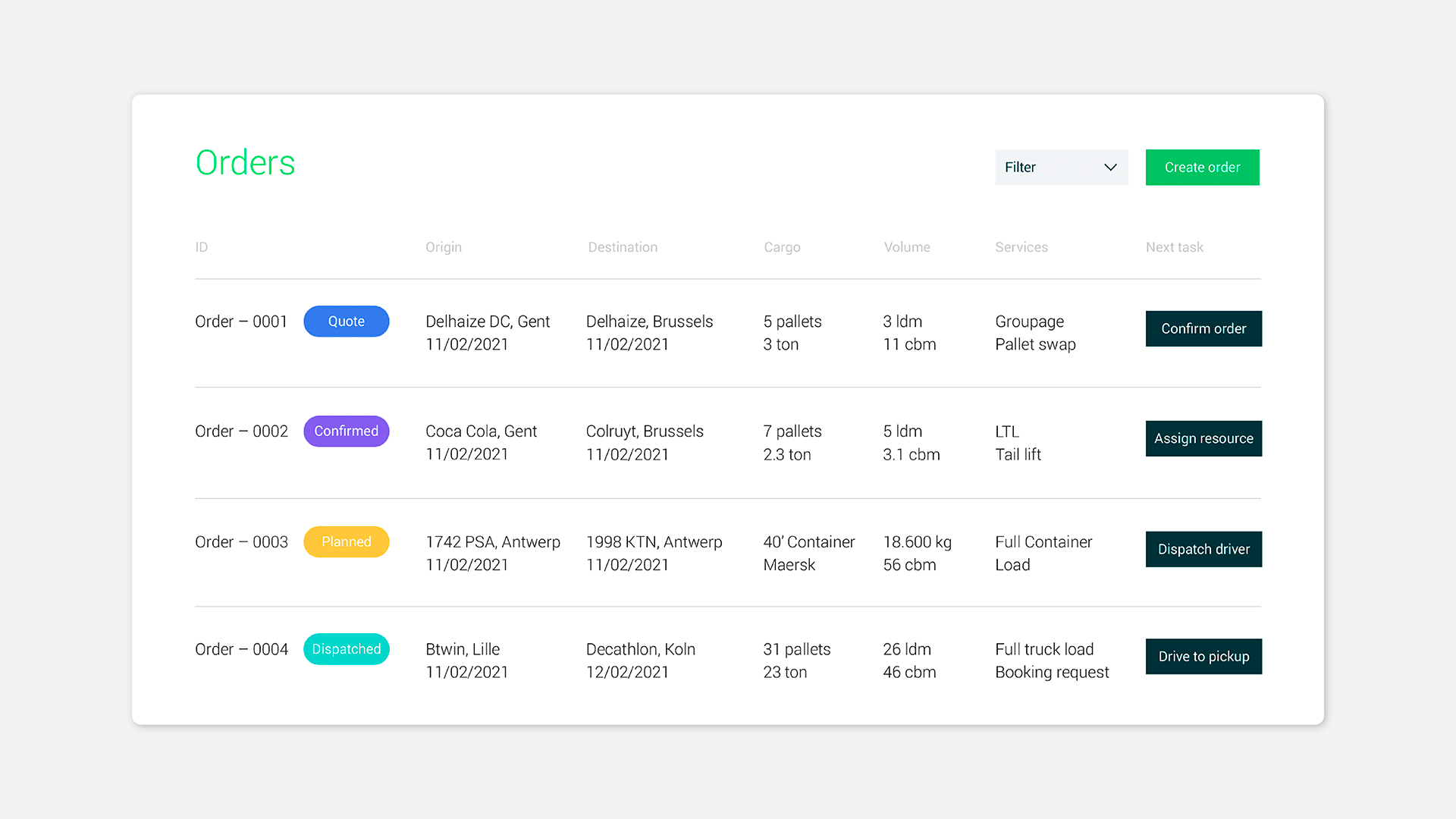
Qargo is a new AI-enabled transport management system that streamlines entire logistics workflows into one easy interface, automating admin and optimising planning – freeing up business owners by offering simplicity in a disconnected industry.
Working closely with the team from Qargo, a clear positioning strategy was created for the new brand, championing the efficiency, innovation, and sustainability of the platform. ‘Grow your business, not your workload’ became the guiding principle for developing the identity and website.
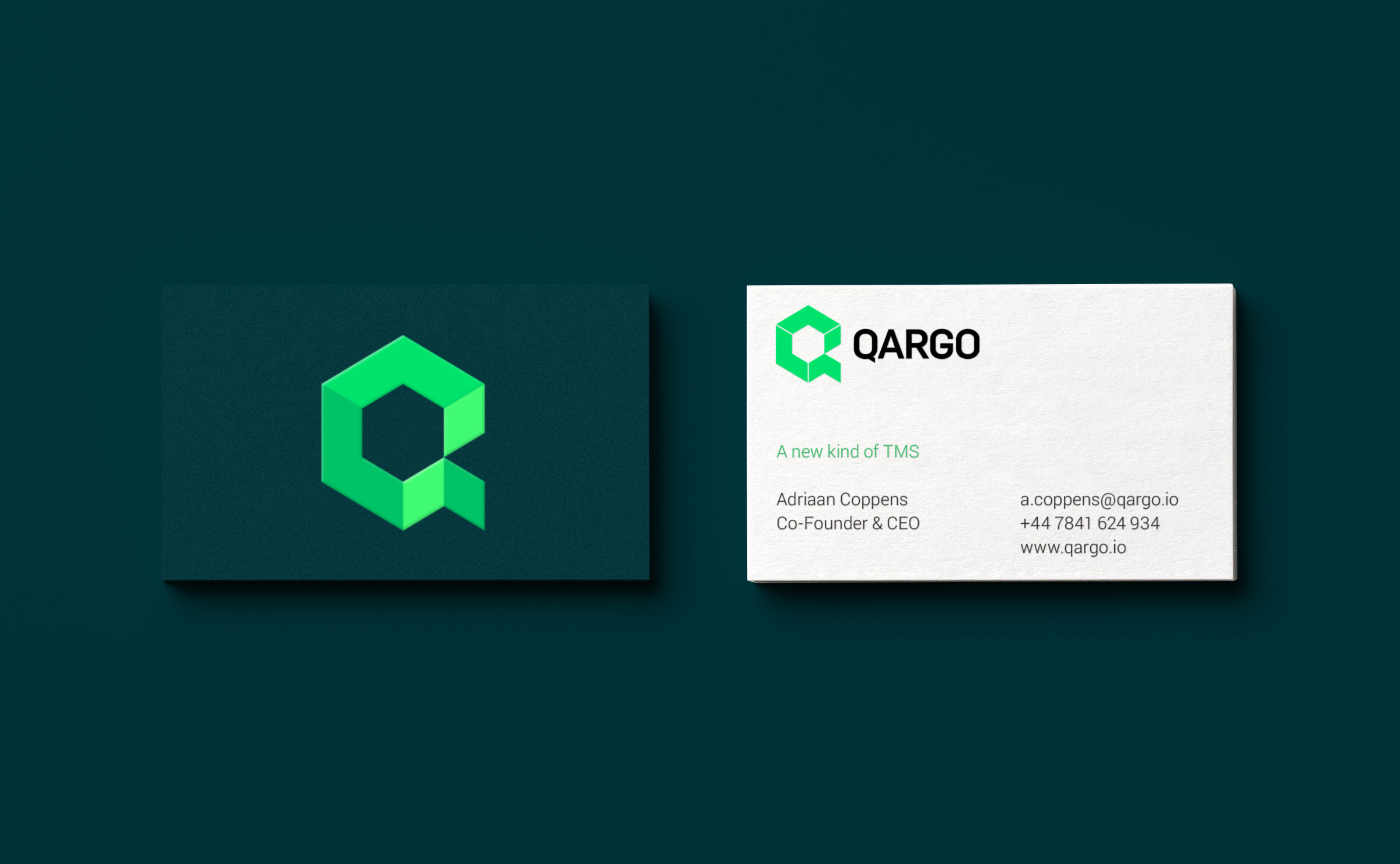
The logo is designed to represent the coming together of the different tools and tasks required to execute transport operations in one AI powered web application. The shape is an isometric, 3D stack of parcels forming the letter Q.


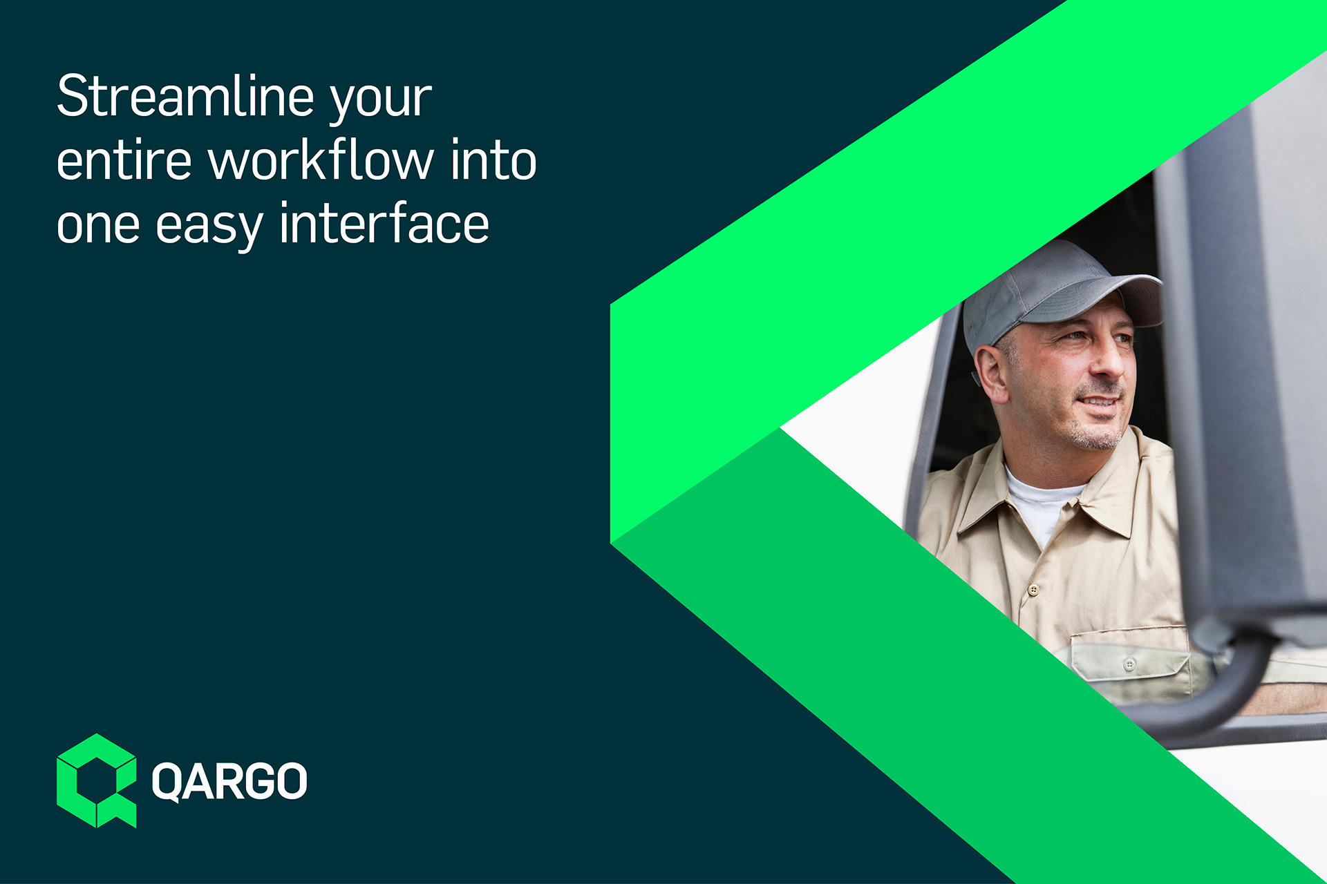
The isometric, animated icons and illustrations support the core brand, delivering key messages and adding clarity to the capabilities of the platform by highlighting key features and benefits in addition to specific functions of the interface. The vibrant green colour palette represents the company’s focus on sustainability with a digital edge. It is deliberately eye catching and is designed to challenge the industry stereotypes of sautéed and heavy colors like reds, dark greens and blacks.